Battle Axe Cafe

Battle Axe Cafe
My client was opening a new axe-throwing business in Ohio city. He offered a unique experience where customers can come in and throw axes at targets while enjoying food and drinks. His target audience was young professionals who would rent out the small venue for private parties. My goal was to design a new website that is visually appealing, user-friendly, and optimized for mobile devices.
Research:
To begin the design process, I conducted research on similar businesses and their websites to understand what works well and what can be improved upon. I also gathered information from the client about their target audience and business goals.
Through my research, I found that many similar businesses use vibrant colors and bold typography to create a fun and exciting atmosphere on their websites. Additionally, I learned that mobile optimization is critical for businesses targeting younger demographics, who are more likely to browse the web on their phones.
Design:
Based on the research and the client's needs, I developed the following design goals for the new website:
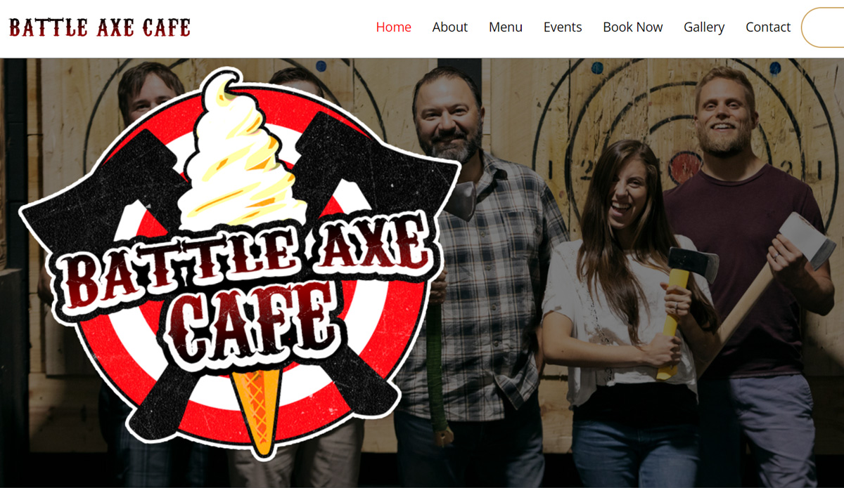
A visually appealing design that reflects the excitement and energy of axe throwing.
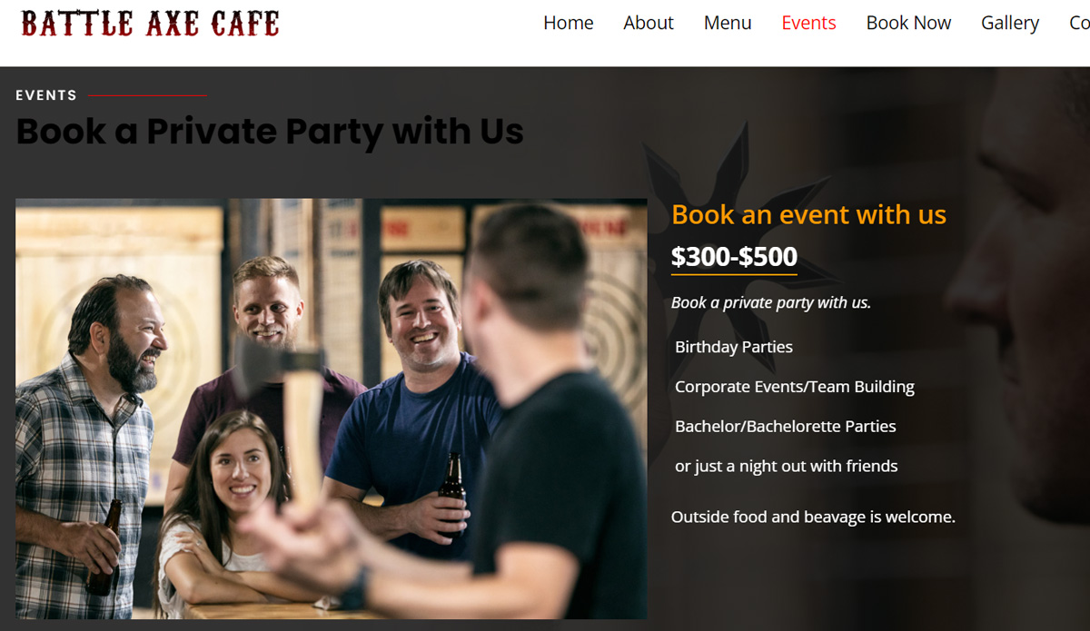
Clear and concise information about the business's offerings, pricing, and location.
An easy-to-use interface that allows customers to book reservations and purchase packages online.
Mobile optimization to ensure a seamless experience on all devices.
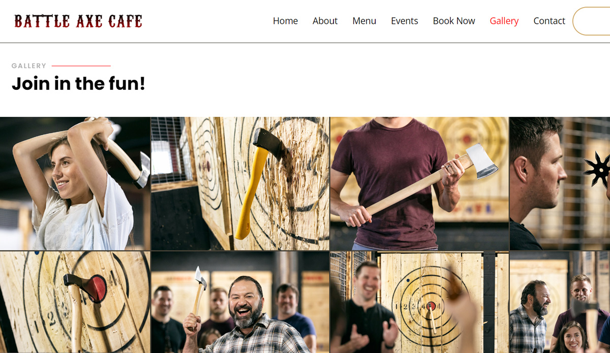
To achieve these goals, I designed a website with a bold color scheme and high-quality images that showcase the excitement of axe throwing.
I also incorporated playful typography and animations to create a fun and energetic atmosphere.
I organized the website's information into clear and concise sections, including an about us page, information on pricing and packages, and a contact page. Plus a booking system was added that allowed customers to reserve a lane and purchase packages online.
To ensure mobile optimization, we used a responsive design that adapts to all screen sizes and tested the site on various mobile devices.

Launch: After testing and refinements, the new website was launched. The client was thrilled with the design and functionality, and customers found it easy to use and visually appealing. The new website helped increase online reservations and overall engagement with the business.
Results Since launching the new website, the client has seen an increase in online reservations and overall engagement with the business. Additionally, the website's mobile optimization improved the user experience and accessibility for customers on-the-go.
Overall, the website has been a success and has helped the client establish a strong online presence that accurately reflects the excitement and energy of their business.

