HUB
The Hub to Your Hands
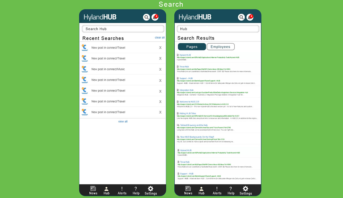
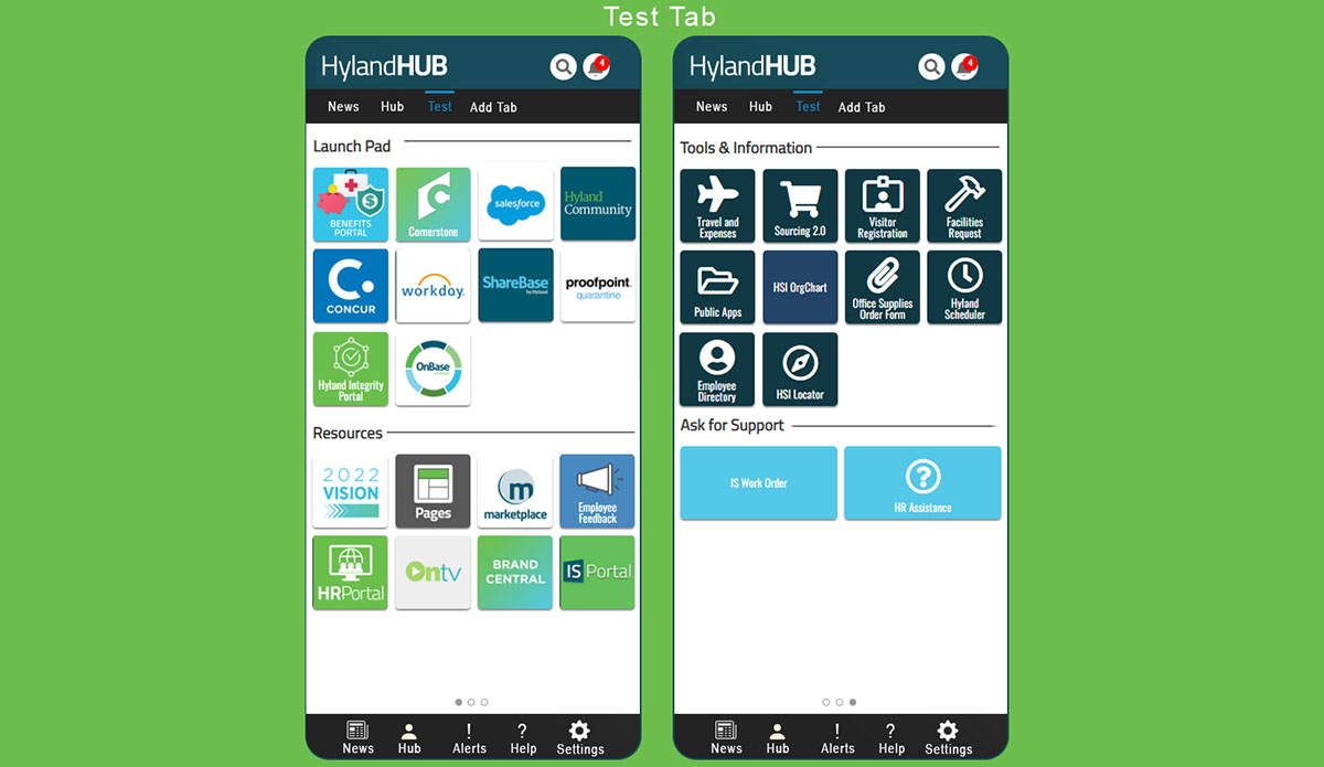
The Hyland HUB is a platform that allows employees quick and easy access to company news and important information. From connecting to the HR portal, taking a PTO day, scheduling a haircut, or filling out a work order with the IT department, everything is just one click away!
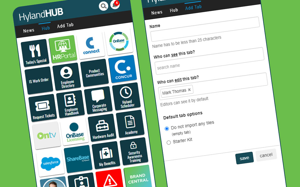
The HUB is easy to customize as well, you can add tiles for quick access to team projects or the style guides for company branding.
During the pandemic and lockdown, it became clear that employees needed a mobile version of the HUB.
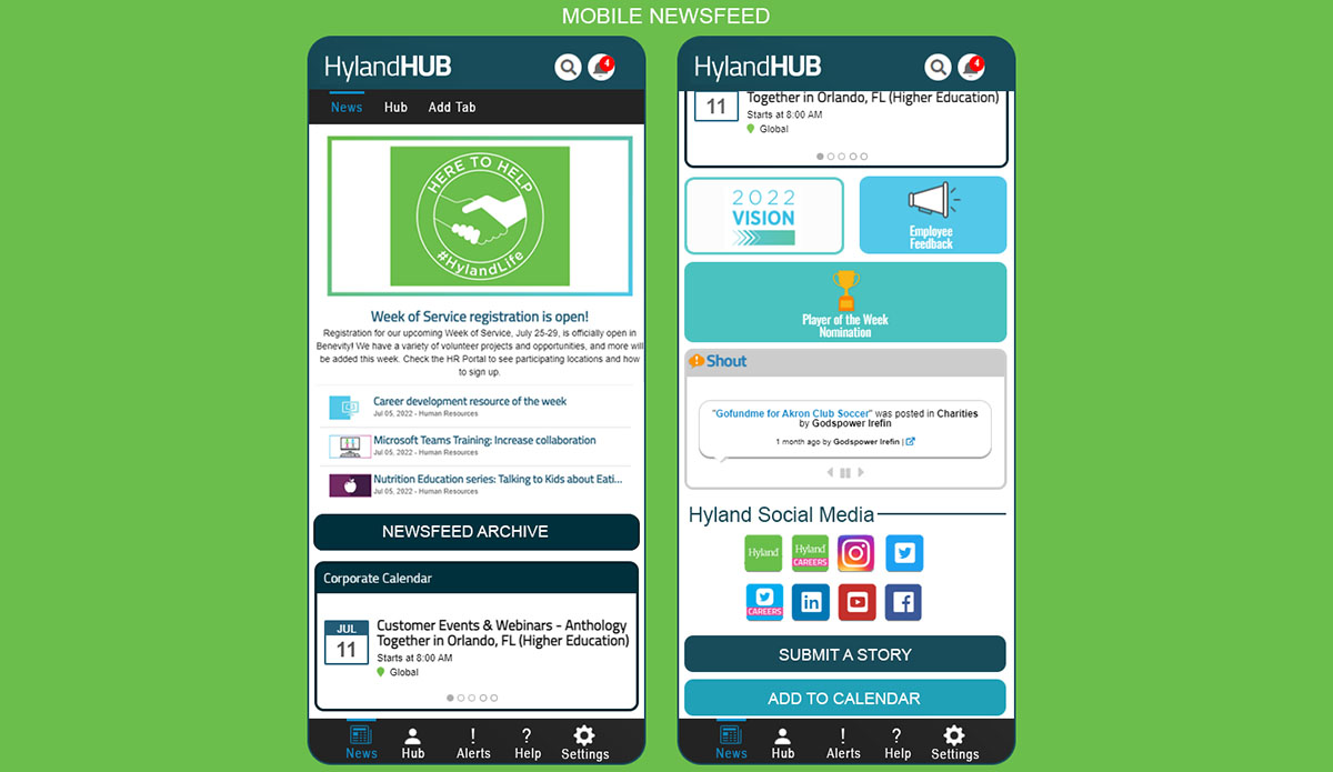
Goal: To improve the user experience and offer the hub on mobile devices.
The challenge was the site was not built with mobile-first in mind. So it wasn't responsive to mobile phones or tablets.
Research: To understand the problem better, I conducted a series of user interviews and analyzed website analytics to identify the issues that users were facing.
Non-responsive design: The site was not optimized for mobile devices, resulting in poor display and functionality on smaller screens.
Cluttered interface: Although the site was easy to navigate and interact with, when used on a mobile device, the site had a cluttered interface that made it difficult for users to find what they were looking for.
Responsive design: Optimize the site for mobile devices, ensuring that it displays properly and functions smoothly on smaller screens.
Simplified interface: Streamline the site's interface, making it easier for users to navigate and find what they're looking for while keeping the site familre to the user.
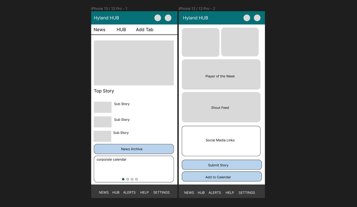
Design: I created wireframes and prototypes for the mobile site, incorporating the following design elements:
Responsive design: The plaform was rebuilt in bootstrap which allowed for responsive design that adapts to different screen sizes and orientations.
Simplified interface:A streamlined interface that emphasizes key content and removes clutter.
Testing: I conducted user testing on the mobile site with a group of users, asking them to complete tasks such as adding tiles, searching for information, scheduling services and requesting PTO . The feedback was positive, with users reporting that the site was easy to use, displayed properly on their devices, and had fast load times. Users also reported that the simplified interface made it easier to find what they were looking.
Conclusion: The move to mobile was a success making the HUB and useful information more accessible to employees who were not always by their laptops.